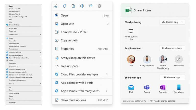
While the whole design was a big change, a small but notable change was made to context menus to make them more helpful and simple. Microsoft has detailed these changes today in a blog post, explaining the changes.
Windows 11 Context Menu Change
Context menus are real-life savers in some situations. For example, right-clicking on items gives you quick options with that item without scouring into the settings and other button shortcuts. But, the general context menu for most elements in Windows OS has become useless over the years. From XP to Win10, we’ve seen tens of unwanted, or say not commonly used, options set in the context menu. For example, right-clicking on a picture in File Explorer opens the context menu, which has options like “Create a new video,” “Edit with Paint 3D,” etc., on the top, and most used general options like copy, paste, delete and rename at the bottom. Moreover, twin options like Open and Open With aren’t set one after the other but at different menus. And the combination of third-party commands lengths the context menu, making it hard and useless. But, this has changed in Windows 11. As Microsoft noted in its blog post, the general context menu in Windows 11 has been redesigned to surface the important (or commonly used) options at the top and push back or categorize others in different sections. So far, this is a good idea. We now have important options like Cut, Copy, Paste, etc., on the top, and also the Open and Open With options next to each other. Also, the third-party commands are now set into various sections as per their nature, letting users scour through the sections if needed. This avoids a long list of context menus, hiding the background window. But if the user wants an old-school type context menu, they can hit Shift + 10 keys on the keyboard to open the full menu. There’s also a “Show more options” in the new menu, though.

